Overview
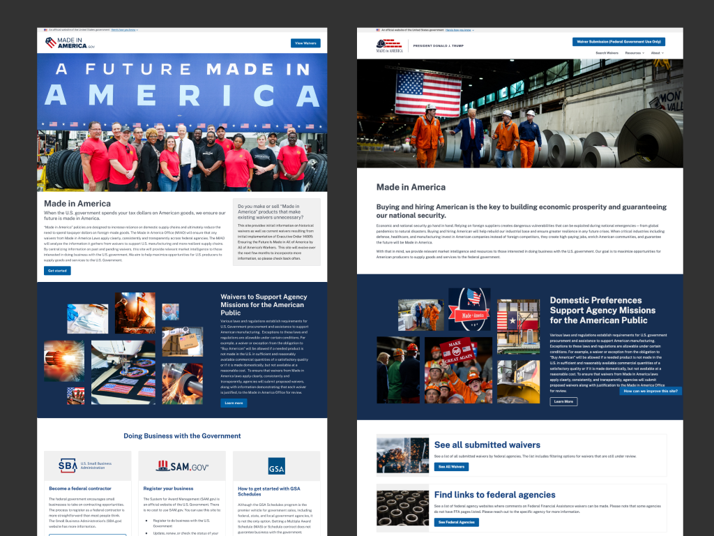
In January 2021, Executive Order 14005 directed the federal government to maximize its use of goods, services, and materials made in America — and to be open about how agencies make those buying decisions. Part of that mandate landed on GSA: build a public website where anyone can see which Buy American waivers have been proposed, and which have been granted.
Ad Hoc supported GSA and the Office of Management and Budget through a four-week design sprint in the summer of 2021. I was the only designer on a three-person team. I designed the site's identity, built the content map with subject-matter experts across both agencies, and delivered the mockups and clickthrough prototype the site was built from.
It launched. It's still live.
The Problem
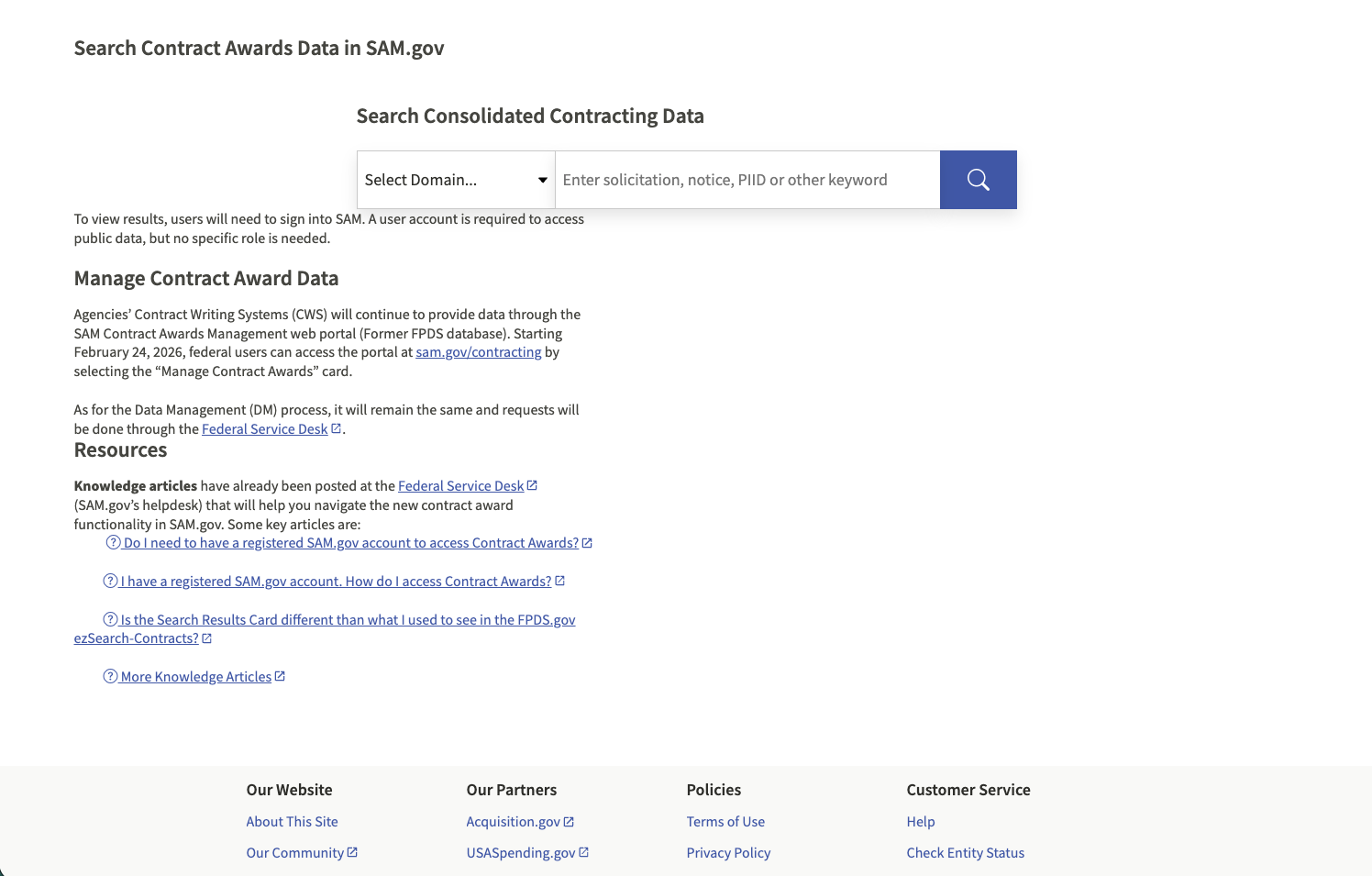
If you ran an American manufacturing business and wanted to sell to the federal government, there was one place to find out what the government had decided it couldn't buy in America: the Federal Procurement Data System. FPDS is renowned for being difficult to maneuver. In practice, the information was public and unreachable at the same time.
That gap matters more than it sounds. When an agency grants a nonavailability waiver, it is saying out loud that something the government needs cannot be sourced domestically in sufficient quantity or quality. For a domestic manufacturer, that is not paperwork. That is a gap in the supply chain with their name on it — if they can find it.
"How does an American manufacturer find out what the government can't buy in America?"
The mandate was a one-stop shop: every waiver, in one public place, in language a business owner could read. Procurement waivers, federal financial assistance waivers, and Jones Act waivers, which cover cargo transported by water between U.S. points aboard vessels that must be American-built, American-owned, and American-crewed.
My Role
Sole designer on a three-person team. Olesya Minina ran the program, Ben Kutil advised on technical solutions as needed, and I owned design end to end:
- Site identity and logo
- Facilitating the content map with subject-matter experts at GSA and OMB
- Defining the page templates and the content that belonged on each
- Writing copy specifications where the content didn't exist yet
- Mockups and a clickthrough prototype
- Designing on USWDS 2.0
Four weeks, from kickoff to delivered prototype.
Design Approach
- Content before pixels. The content map came first and the mockups came second. On a site whose entire purpose is making specific information legible, deciding what the pages say is the design work. Everything after it is execution.
- USWDS as a foundation, not a skin. The U.S. Web Design System isn't a style kit you apply at the end. It's an accessibility baseline the federal government has already done the hard thinking on. Building on USWDS 2.0 meant the components arrived accessible, and my job was to not break that while giving the site an identity of its own.
- Design the template, not the page. A waiver isn't one thing. Procurement nonavailability, public interest, federal financial assistance, Jones Act — they carry different content and different justifications. Designing a page for "a waiver" would have failed on contact with the second kind.
The Content Map
This is the part of the project I'd point at first.
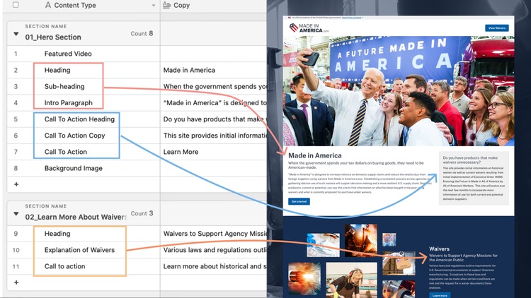
We started by identifying which pages and templates the experience needed, then worked out exactly what content belonged on each one. For waivers, I built a template rather than a page, so it could accommodate the range of content a waiver might actually contain depending on its type.
The harder problem was that a lot of the content didn't exist yet. Agencies hadn't written it. On most projects that's where things stall — design waits for copy, copy waits for approval, and the sprint quietly becomes a quarter.
So where the content was still undetermined, I wrote a specification instead: what the copy needed to say, and how long it needed to be. The agencies could then write to a shape that had already been designed, rather than the team designing around copy nobody had produced.
That one decision is why the rest of the sprint moved the way it did.
The Identity
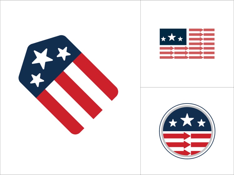
I presented a set of logo options. The one chosen paired the colors, stars, and stripes that immediately read as the United States with a price tag — the procurement transaction itself, made visible. The stars stood for life, liberty, and the pursuit of happiness.
Transparency was the entire point of the site. The mark said so before anyone read a word.
The Build
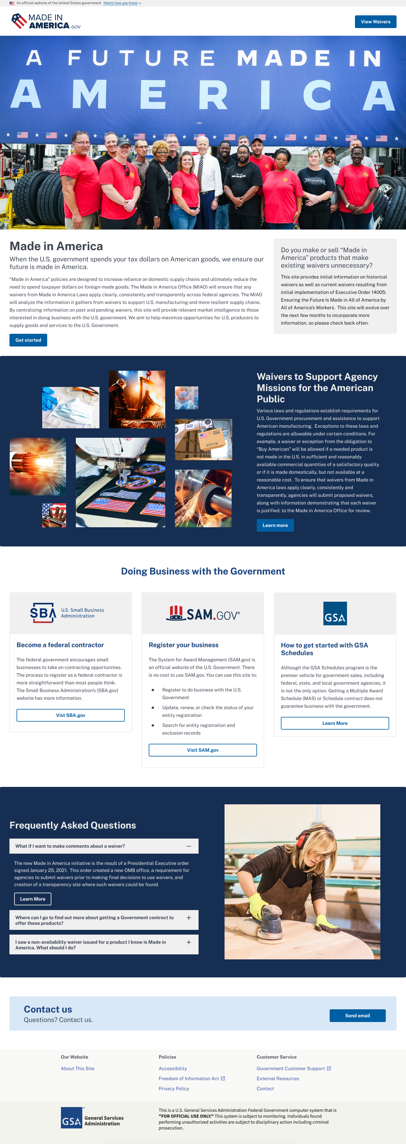
Because the content was already approved and we were designing on USWDS 2.0, the two-page website and the clickthrough prototype came together in less than a week, with no design revisions.
That number tends to get read as a story about speed. It isn't. Zero revisions is what happens when the arguments finish before the mockups start. The content map had already settled what the site said, who it said it to, and what shape each piece of information took — so by the time there was something to look at, there was nothing left to litigate.
Outcomes
- A public place where waivers are easy to find for businesses seeking to work with agencies, instead of buried in FPDS
- A site identity and logo that gave the initiative something recognizable
- More transparency in federal procurement for American businesses
- Domestic suppliers able to see, in plain terms, the gaps they might be able to fill
Five years on
The site has grown well past the two pages I designed, and it has been through a complete content replacement and a change of administration since 2021.
The thing it does has not changed. Waivers are public, searchable, filterable by type and status, and downloadable in bulk. Procurement nonavailability, public interest, federal financial assistance, and Jones Act waivers all still live in one place under one template, which is the problem the content map was built to solve.
An information architecture that survives having all of its content swapped out is the only real proof that the structure was right. Most of what I've designed, I can describe. This one you can go use.
Reflection
Made in America was four weeks and two pages, which makes it the smallest project on this site and the one I'd defend hardest.
It taught me that the fastest way through a project is almost never to start designing sooner. We shipped in under a week of drawing because we spent the weeks before it deciding what was true — what the site was for, who needed it, and what each page had to say. Design was the easy part by then, and it was easy on purpose.
It's also the work that made me want to do more of this kind. Somewhere there's a manufacturer who found a waiver in ten seconds instead of giving up on FPDS. I'll never know who. That's fine.
Next project Innovation Alpha