Structure should be discovered, not assumed
The fastest way to build a navigation nobody can use is to build the one that makes sense to the team. Teams know their own product's internal logic too well to feel where it's strange, and by the time a structure is in production it's expensive to move.
So I derive it instead of proposing it. The sequence I use:
Stakeholder and SME interviews. Not to gather requirements — to find out what people are actually trying to accomplish, and in whose vocabulary. On Innovation Alpha, this meant investors, IP analysts, and patent attorneys, three groups with three different definitions of a good answer.
Personas built from real objectives. Not demographic sketches. Each one carries a specific thing someone is trying to do, and that objective becomes the benchmark every later decision gets tested against. If I can't trace a design choice back to something a real person told me they were trying to do, I've started guessing.
Open card sorting. I give people the pieces and let them build the structure. On Khora, thirteen participants sorted feature cards into groups, named the groups, and explained their reasoning. Two of the six final categories — "Real-world Practice and Application" and "Personal Progress and Planning" — weren't in my original buckets at all. Participants kept grouping features that way until it was obvious the structure existed and I'd missed it.
Quantitative and qualitative analysis. A card sort is easy to run and hard to read. I track how often features get grouped together, how much participants agree, and where the outliers sit — then pair that with why people grouped things the way they did. The numbers tell you what happened. The reasoning tells you whether to trust it.
A standardization grid. Every feature mapped against every category, scored by how consistently participants placed it there. Features that split the room get flagged, not forced.
Tree testing. The proposed structure goes back in front of users, who are asked to find things inside it. This is where I learn which labels I got wrong. Then I fix them — before anyone builds a screen on top of them.
The work I'm proudest of tends to be the structure underneath rather than the surface on top. On madeinamerica.gov, the content map I facilitated with subject-matter experts at GSA and OMB is still the shape of the site five years and one full content replacement later. Nobody looks at an information architecture. It's just quietly correct or quietly in the way.
Accessible by construction, not by audit
Accessibility that arrives at the end of a project is a bug report. By then the layout, the interaction model, and the vocabulary are all settled, and the only moves left are cosmetic. I'd rather make the decisions in the order that lets them be real decisions.
What I design against. WCAG 2.1 AA and Section 508. On federal work, the U.S. Web Design System — which I treat as an accessibility baseline the government has already done the hard thinking on, not a style kit to apply at the end. Building on USWDS means components arrive accessible and my job is to extend them without breaking what makes them work.
What I check as I go. Color contrast. Heading structure and whether the document outline makes sense read on its own. Keyboard paths and focus order. Form labeling, and error messages that say what's wrong rather than that something is. Target sizes.
Plain language is the same job. A page nobody can understand isn't accessible, whatever its contrast ratio. On Made in America, writing the content map and the copy specifications was accessibility work — deciding what each page had to say, to whom, in what terms, for an audience of business owners who don't speak procurement. On Symetra, an audience of customers 45 and up meant clear and jargon-free wasn't a nice-to-have; it was the difference between a customer completing a payment and calling someone.
Where it gets genuinely hard. Data visualization. On Innovation Alpha the entire product was dense, comparative charts, and dense comparative charts and screen readers do not naturally get along. There's no version of that problem where you apply a rule and it's solved — you're making judgment calls about what the chart is for, which comparisons carry the meaning, and how to make those available to someone who isn't looking at it. I don't think I finished that problem. I think I made it better and I know exactly which parts I'd want a proper research budget to test.
That last paragraph is the honest state of it. I'd rather tell you where the hard edge is than present a checklist and let you find out later.
Systems that survive one maintainer
I've been the only designer on products large enough to need a design system. That constraint shaped how I build them: a system's real test isn't whether it's elegant on the day it ships, it's whether it stays coherent when the person maintaining them is busy. Which is most of the time.
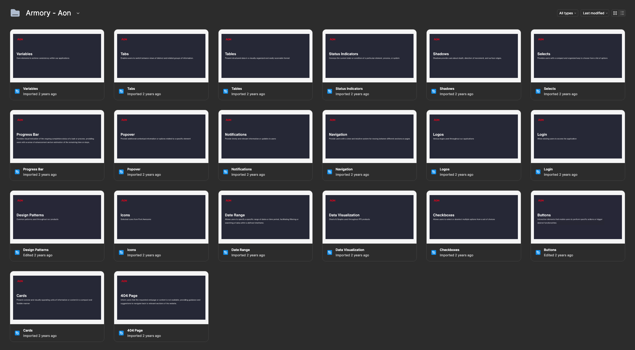
Armory — the design system behind Innovation Alpha — came out of that. Instead of one sprawling library, every component lived in its own Figma file. Tabs, tables, status indicators, selects, popovers, navigation, data visualizations, buttons, cards: each one self-contained. That cut the bloat that bogs down a monolithic library, made any component findable and workable in isolation, and let me change one pattern without disturbing the rest. Other product teams eventually adopted it as their foundation.
Symetra taught me the same lesson at team scale. Twenty-one people started with every feature crammed into a single Figma file, and it buckled — analysts, product owners, and developers all struggled to find what they needed. I split each feature into its own file with a consistent page structure. One clear home per thing, which is the same instinct that keeps a component library clean.
The parts that aren't files. A handoff guide, so design and development working the same feature in the same sprint always knew whether it was ready to build. Hands-on Figma training built around practice rather than slides, so client-side designers could contribute to the library without creating design debt. Those are system infrastructure too. A component library with no shared understanding of how to use it degrades on contact with a deadline.
I'm looking for senior design work in public service.
Full-time, fully remote, available now. Email is the fastest way to reach me.