13 participants · interviews → 4 personas → open card sort → co-occurrence and participant-agreement analysis → standardization grid → tree testing in Treejack → validated information architecture
I conducted all thirteen interviews and facilitated every card sort and tree test session myself.
Overview
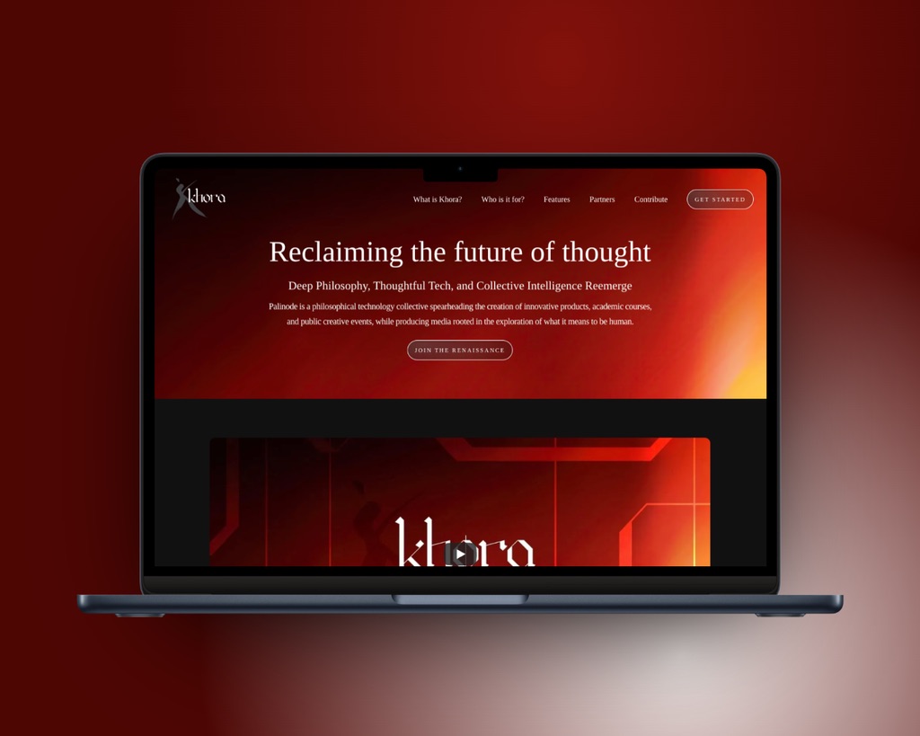
Khora is an open-source, multimedia platform for philosophical content — a "search engine done otherwise" for navigating the history of ideas and connecting them to modern life. Its promise is organic, non-linear discovery that meets people wherever and however they like to learn.
That promise lives or dies on one thing: how the whole experience is organized. I owned the foundational research that answered it, moving from interviews, to personas, to a card sort, to tree testing, and turning all of it into the information architecture the product would stand on.
The Problem
Khora set out to make philosophy approachable through organic, non-linear exploration. But a platform that connects ideas across books, podcasts, film, and discussion — for an audience running from tenured professors to digital artists — faces a hard first question: how should all of it be organized?
Philosophy resists tidy hierarchy, and Khora's users could not be more different in how they learn. An information architecture that felt natural to one of them could feel alien to another.
"How do you build one structure that feels intuitive to a philosophy professor and a digital artist alike?"
My Role
I owned the discovery research that shaped Khora's structure, start to finish:
- Conducting all thirteen user interviews
- Turning those interviews into the personas that represented Khora's core audiences
- Designing and facilitating the card-sorting study
- Validating the resulting structure through tree testing
- Synthesizing it all into the proposed information architecture
Design Approach
- Interviews, then personas. I started with conversations — thirteen prospective users, asked about how they engage with philosophy — and turned what I heard into personas capturing genuinely different ways of learning.
- Card sorting to surface structure. Rather than impose a navigation scheme, I ran a card-sorting study so the people who would use Khora could show me how they naturally group its features.
- Tree testing to validate it. I put the resulting structure back in front of users to confirm they could find what they expected, and refined what they couldn't before anything was built.
Interviews & Persona Creation
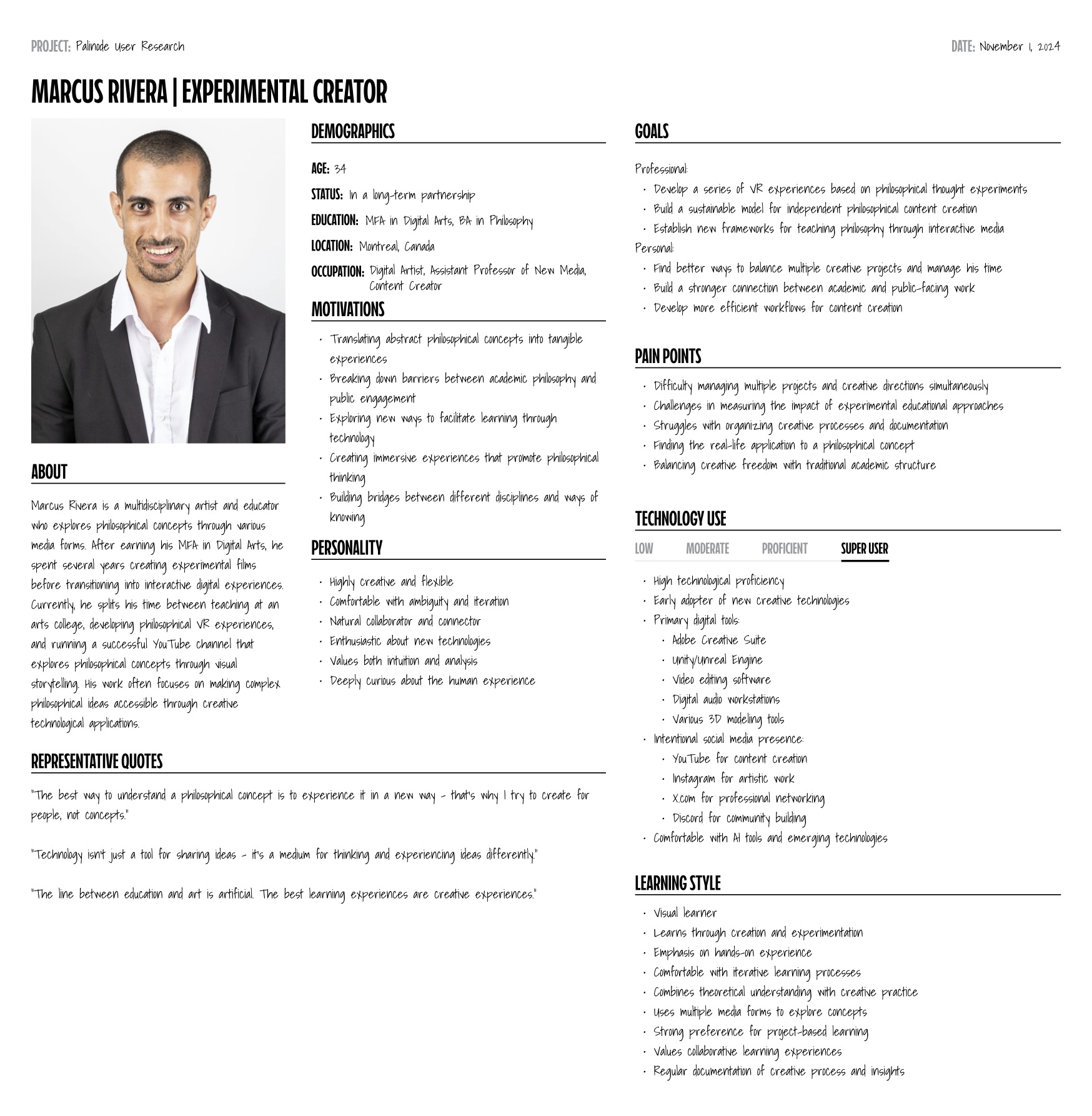
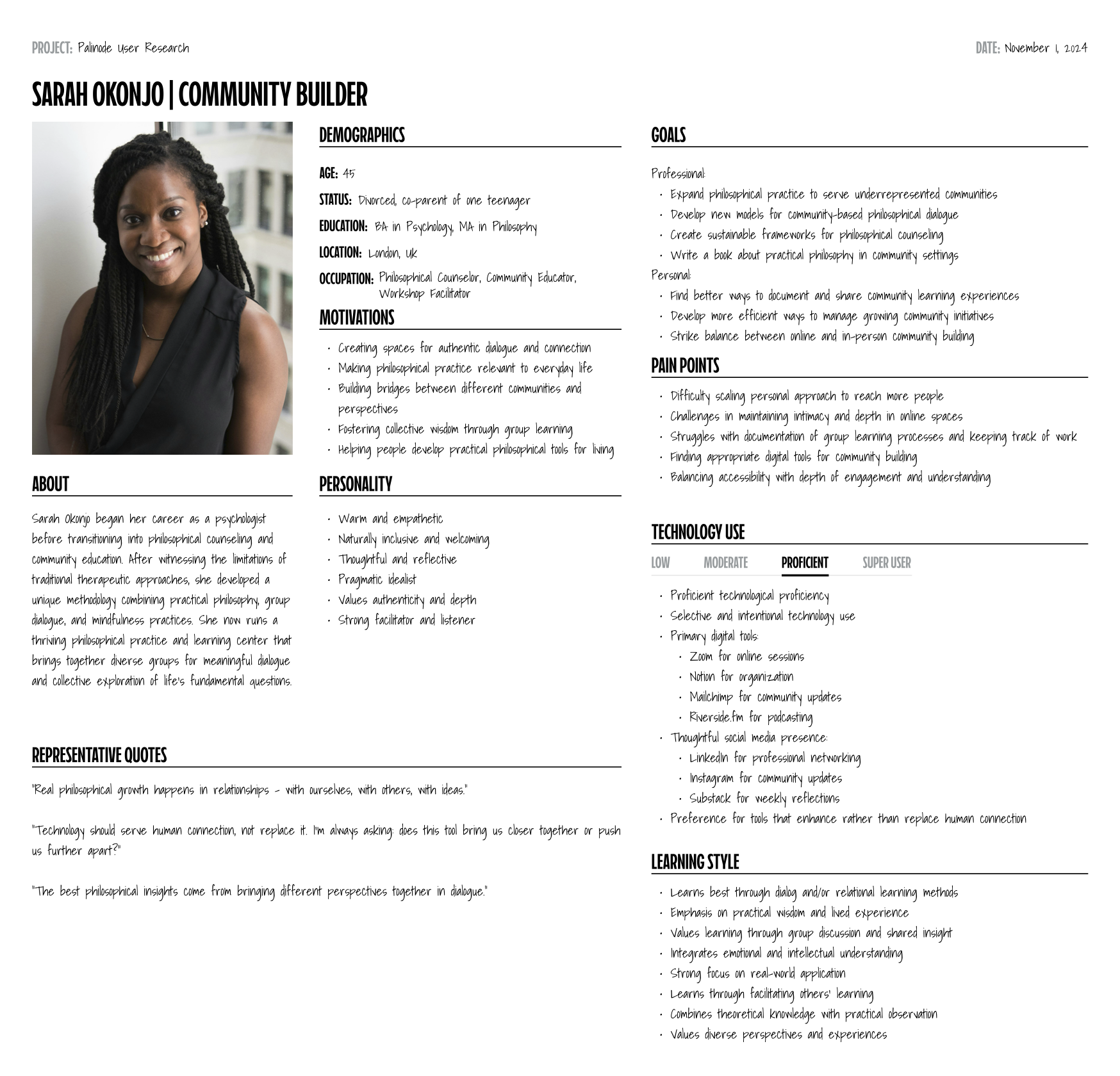
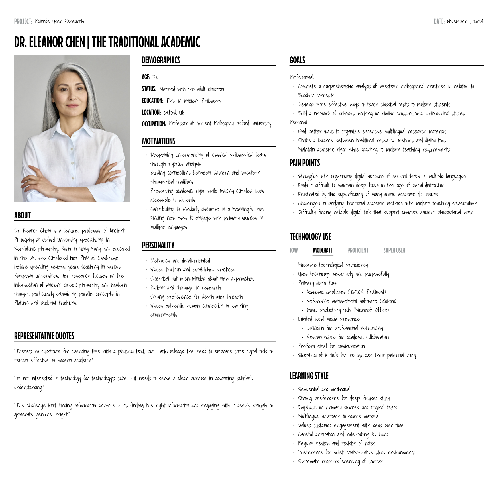
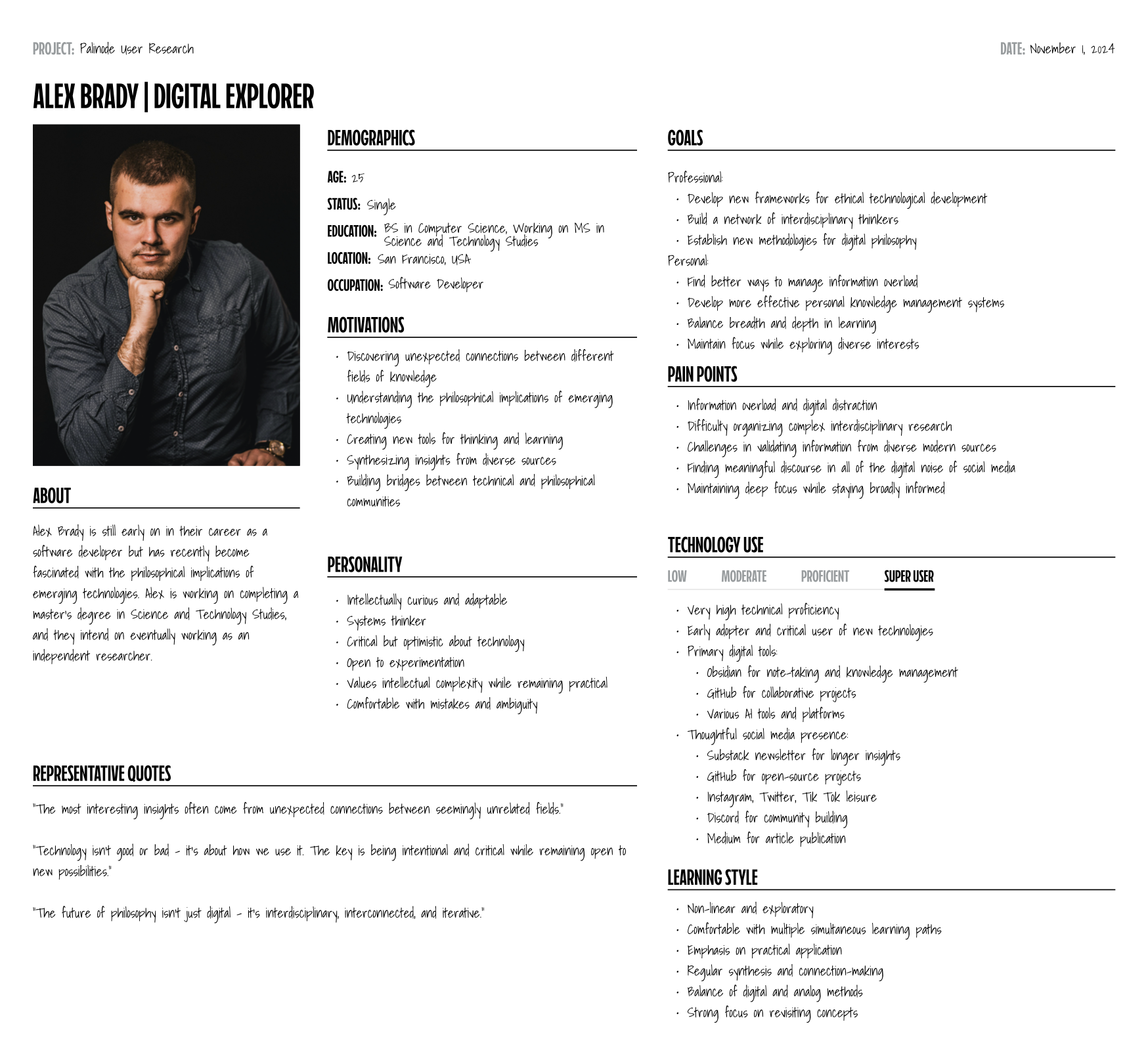
It started with conversations. I interviewed thirteen prospective users about how they read, learn, and engage with ideas, and those interviews became four personas — each a distinct way of moving through ideas. Designing for all four at once was the whole challenge:
- Marcus, the Experimental Creator. A digital artist who learns by making; he wants to explore philosophy through visuals, media, and hands-on creation.
- Sarah, the Community Builder. A philosophical counselor who learns through dialogue; she values discussion, relationships, and putting ideas into practice with others.
- Dr. Chen, the Traditional Academic. An Oxford professor who learns methodically from primary texts; she wants rigor, depth, and careful, sequential study.
- Alex, the Digital Explorer. A developer who learns by wandering; he follows non-linear paths and lives for unexpected connections between fields.
Four people who would never navigate the same way: a visual maker, a talker, a methodical scholar, and a synthesizer. The job wasn't to pick one. It was to find a structure that welcomed all of them.
Card Sorting
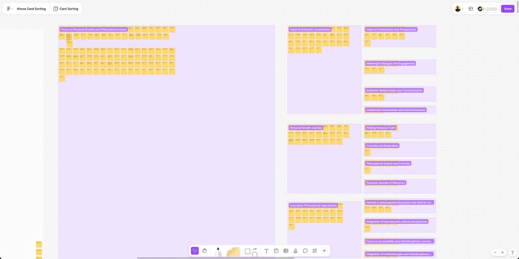
With the personas in hand, I needed a structure that worked for all of them. So instead of designing the navigation and then testing it on people, I had people build it first.
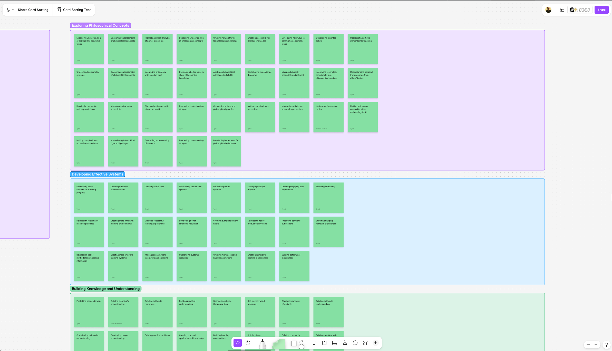
I created a set of feature cards covering everything Khora might offer — a philosophical text library, visual concept maps, discussion forums, reflection prompts, tools for finding opposing viewpoints — and asked participants to group the cards however made sense to them, name their groups, and explain their reasoning.
Out of how real people sorted those features came the categories that became the backbone of Khora's information architecture:
- Content Discovery and Navigation
- Knowledge Building and Analysis
- Community and Discussion
- Personal Learning Tools
- Personal Progress and Planning
- Real-world Practice and Application
The most useful part was what I didn't expect. Categories like "Real-world Practice and Application" and "Personal Progress and Planning" weren't in my original buckets. They emerged because participants kept grouping features that way. The users revealed structure the team hadn't thought to design.
From Sort to Structure
A card sort is easy to run and hard to read. Forty-odd features and thirteen people produce a tangle of overlapping, inconsistent groups, and the real work is turning that tangle into something a product can be built on.
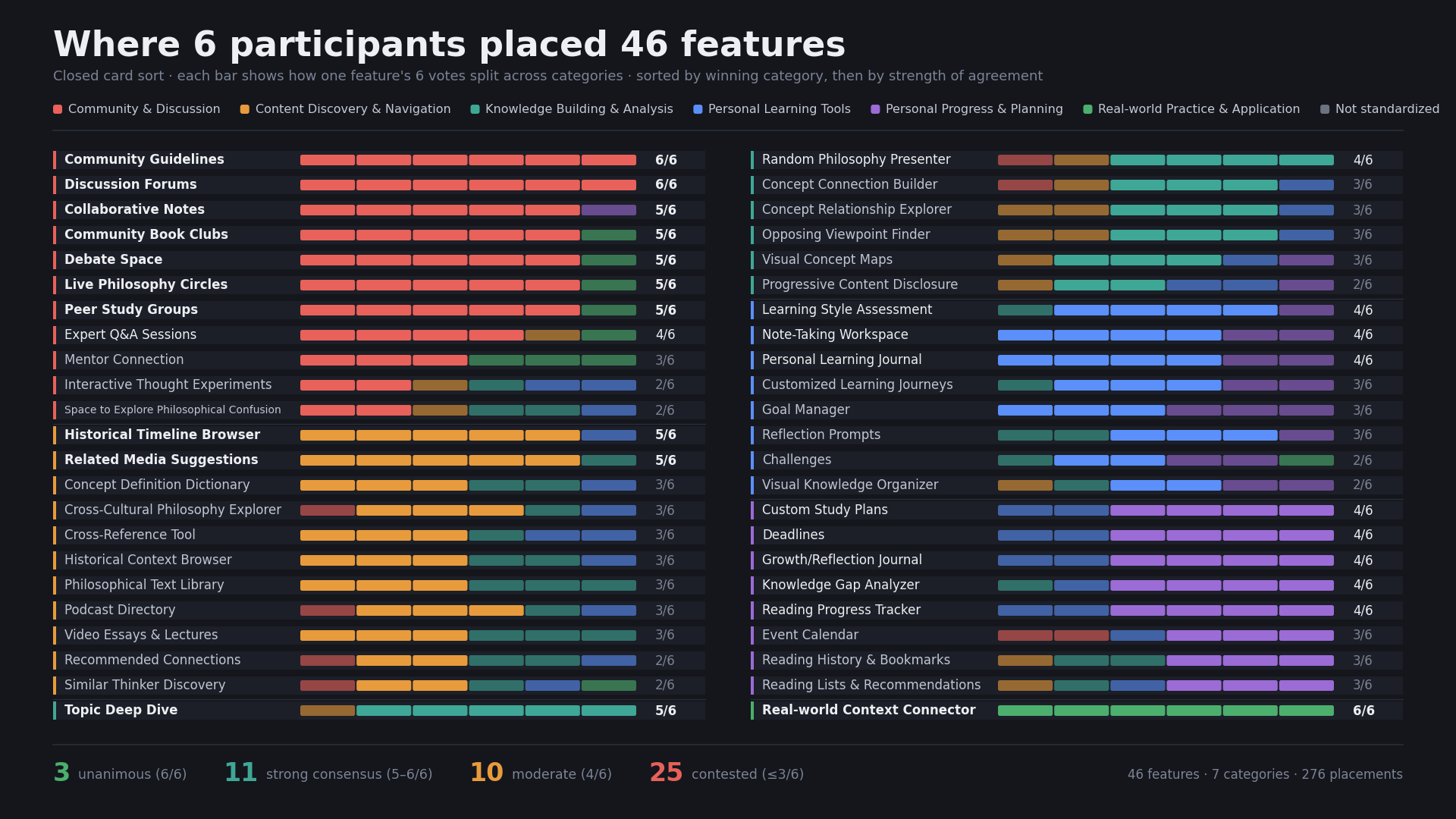
I analyzed the results on two levels. Quantitatively, I tracked how often features were grouped together, how much participants agreed, and where the outliers were. Qualitatively, I captured why people grouped things the way they did — the reasoning that explains the numbers.
Then I built a standardization grid: every feature mapped against every category, scored by how consistently participants placed it there. "Topic Deep Dive" landed clearly in Knowledge Building. "Discussion Forums" in Community. Features that split the room got flagged rather than forced into a category.
Then I validated it. Tree testing in Treejack put the proposed structure in front of users and asked them to find things inside it, which confirmed where the navigation worked and exposed where it didn't. That let me refine the architecture — fixing the labels and groupings that tripped people up — before a single screen was built on top of it.
Impact
The research gave Khora something most products start without: an information architecture derived from how its actual users think and validated by watching them navigate it, rather than assumed by the team. The personas became a shared language for the team, and the standardized, tree-tested categories became the structure the platform was organized around.
The broader effort it fed into was substantial enough to be filed as a United States patent for personalized, interactive learning, on which I am a named inventor.
Reflection
Khora reaffirmed something I believe about this work: good structure isn't imposed, it's discovered.
Four people who learn in four incompatible ways will never hand you a tidy answer. But if you watch how they actually group and navigate ideas, a shape emerges that none of them would have drawn alone. That shared shape is what makes a complex thing feel navigable to everyone.
Next project Symetra Digital Customer Experience