Overview
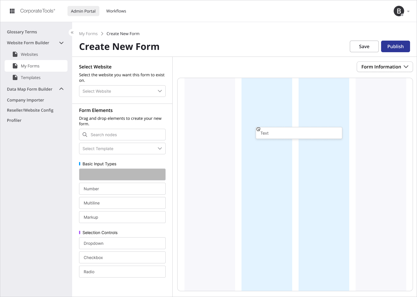
Two threads run through my work at Corporate Tools. The first is a drag-and-drop builder that lets people configure complex notifications and forms without writing anything or waiting on anyone. The second is the Domain Registry, a new product where I lead interface design across the customer experience and the internal tools that support it.
Different products, same underlying idea: the people closest to a problem should be able to solve it themselves.
The Problem
Every conditional workflow needed an engineer.
If someone in the business wanted a notification that fired under particular conditions, or a form that changed shape depending on what a customer answered, the request went into an engineering queue and waited. The people who understood the workflow best — the ones who knew exactly which condition mattered and why — were the ones who couldn't build it.
"Why does changing a form require someone who knows how to code?"
That's a bottleneck, but it's also a slow leak. Requests that have to be justified to a queue often just don't get made, and you never find out what wasn't asked for.
My Role
- Designing the drag-and-drop notification and form-builder tooling
- Lead interface design for the launch of the Domain Registry product
- Designing the internal admin and customer service experiences alongside the customer-facing product
- Analytics-driven investigation of build failures
The No-Code Builder
I designed drag-and-drop tooling that lets non-technical staff configure complex conditional workflows without engineering support.
The design problem in a builder is that you're designing a tool for making things, not a thing. The person using it has a workflow in their head that you'll never see, and your job is to give them enough expressive range to build it without handing them so many options that they can't find the one they need. Too rigid and they're back in the engineering queue. Too flexible and the tool becomes a programming language with worse ergonomics.
What the Analytics Found
The builder was live and people were failing to finish things with it. Not everyone, and not always — which is the hardest kind of problem, because nobody files a bug report that says "sometimes this is confusing."
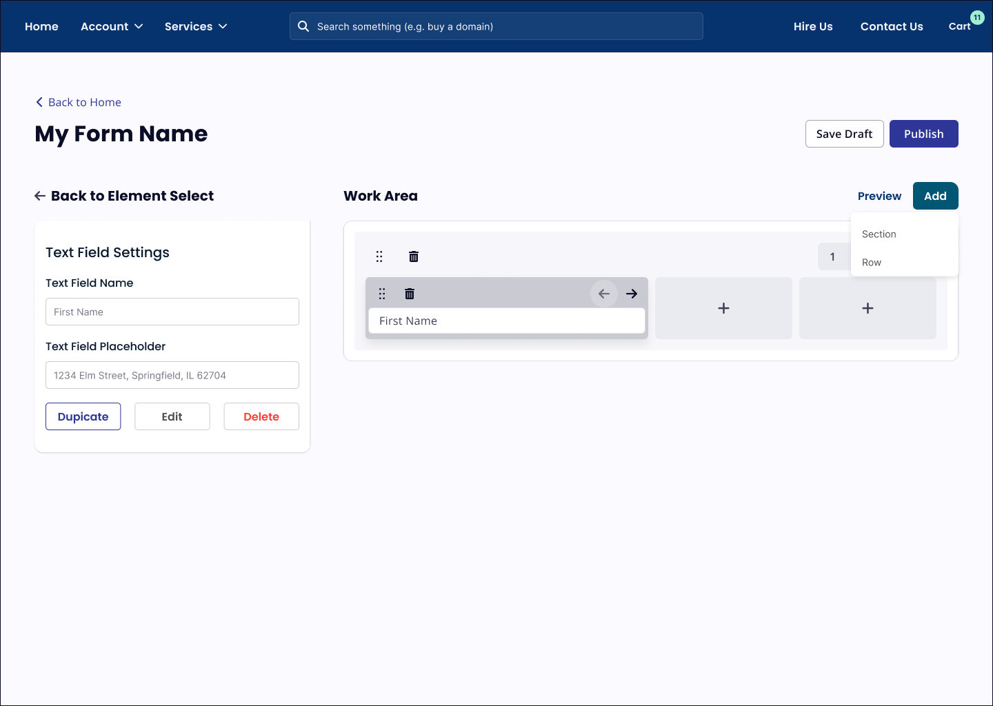
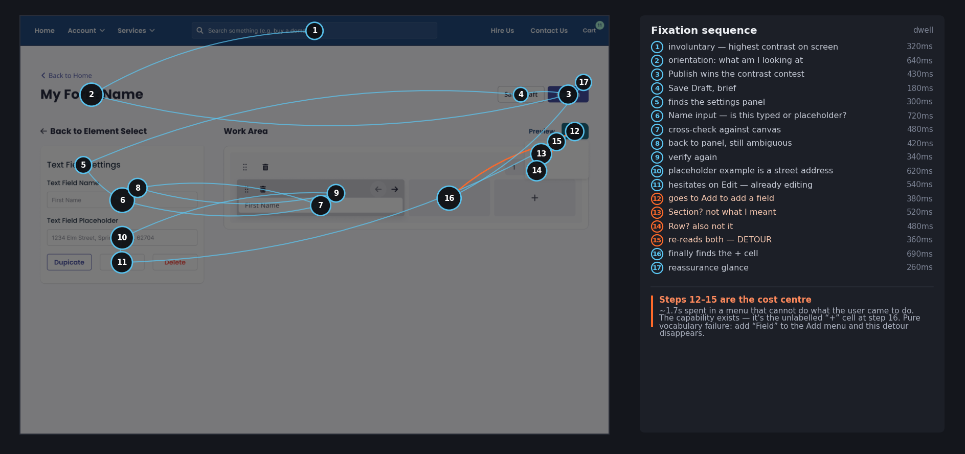
It felt awkward to use, but "awkward" isn't something you can design against. So before touching the layout I modelled where a first-time user's attention would go on the existing build, and in what order — weighting each element by contrast, size, isolation, and position in the reading order, then walking the task the way a novice actually walks it. Seventeen fixations, roughly twelve seconds. The shape that came out wasn't the one the layout implied. Attention reached Publish at about 1.5 seconds — before the user had found a single control that built anything — then dropped into a shuttle between the settings panel and the canvas, crossing the screen four times to answer one question: was "First Name" a value someone had typed, or a placeholder hinting at what they could type? Nothing visually bound the selected element to the panel editing it, so the user paid a full saccade every time they wanted to confirm a change had landed.
The expensive stretch was steps 12 through 15. The user wants a second field, goes to the control labelled Add, and finds Section and Row — neither of which is the thing they came to add. They read both options, re-read both, and leave without selecting: roughly 1.7 seconds inside a menu that couldn't do the job, followed by a scan of the canvas until they stumbled onto an unlabelled "+" cell that could. The capability was never missing. The word was. That reframed the problem from a layout question into a vocabulary question, and it's the finding that shaped the rebuild more than any other. I want to be precise about what this artifact is: it's a prediction, not recorded gaze. Its value wasn't the picture — it was turning a vague sense that the builder felt clumsy into a short list of falsifiable claims, cheap enough to produce in an afternoon and specific enough to carry into the redesign.
Domain Registry
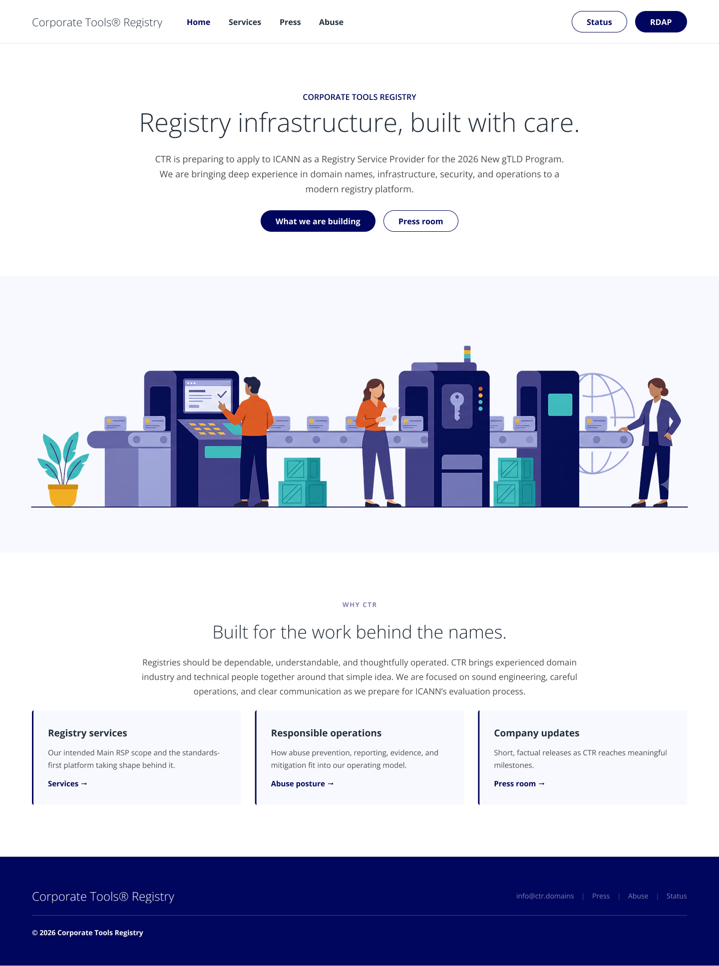
I lead interface design for the launch of the Domain Registry, designing for scale across a product surface that keeps growing.
The decision I'd point at: I designed the internal admin and customer service experiences alongside the customer-facing product, rather than treating the back office as something to fit in afterward.
That means a support agent resolving an issue and the customer who reported it are working against the same model of what's happening. When they're not — when the customer sees one vocabulary and the agent sees another — every support conversation starts with translation before it can start with help. Designing both sides together is more work up front and it removes an entire category of friction that otherwise never goes away.
Visit the live Domain Registry (opens in a new tab)
Reflection
Both threads here are about the same thing: who gets to be capable.
The builder moves that capability from engineers to the people who understand the workflow. Designing the admin experience alongside the customer one means the person answering the phone is as equipped as the person calling. In both cases the design work is mostly a question of where you decide the hard part should live — and the answer is usually "not with the person trying to get something done."
Next project Team Nation