2019
Fresh Consulting
Symetra
From Paper to Digital: Creating a new Digital Customer Experience

Overview
Symetra is an insurance company whose customer experience was almost entirely analog. Statements, billing, even payments were handled on paper. The company wanted to give customers a single digital place to manage everything their policies involved. I joined as a UX designer to help design that experience, from the shared design system underneath it to the pages customers would use every day.
The Problem
Symetra's customers lived in a digital world everywhere except their insurance. They could bank, shop, and pay every other bill online, then had to fall back on paper for statements, billing, and payments. The audience felt that gap most: working professionals, 45 and older, who were used to running the rest of their lives online.
"I can bank, shop, and pay every other bill online. Why not my insurance?"
My Role
This was the largest team I had ever been part of: 3 business analysts, 4 product owners, 9 developers, and 5 designers, all building the product together. As one of those designers, I wore a lot of hats:
Contributing to and maintaining the shared design library
Creating wireframes, mockups, and prototypes
Running usability testing
Writing user stories and acceptance criteria
Sprint planning
Design Approach
A shared design system: I built and maintained core sections of a design library that two product teams, Customer and Partner, both relied on, so the experience stayed consistent no matter who designed it.
Built to scale across a large team: with 21 people moving at once, I created the file structure, handoff guides, and training that kept designers, developers, and stakeholders aligned.
Validated with real users: I stood up the team's usability-testing workflow and tested key pages on both desktop and mobile, so decisions were proven with real users instead of assumed.
Research & Discovery
The audience shaped everything. Symetra's customers were working professionals, 45 and up, with household incomes between $100k and $150k: people comfortable managing money online, but newer to doing it with their insurer. That meant the experience had to earn trust quickly, stay clear and jargon-free, and offer the same ease they already expected from their bank or their favorite store.
To keep the work honest, I helped move the team onto UserTesting.com and wrote a workflow so anyone could run a study. I then tested key pages, like Policy Details, across desktop and mobile, and fed what I learned back into the designs. The goal was simple: validate with the actual audience rather than design for an assumption.


The Solution
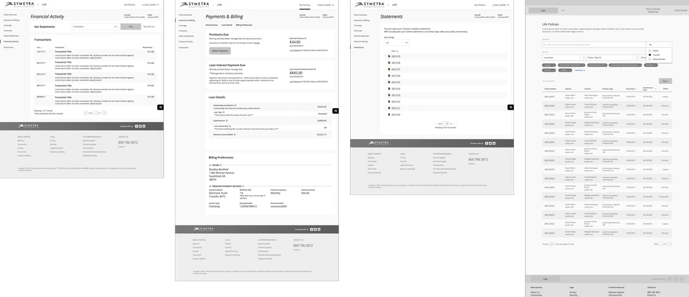
Everything in one place.
The digital customer experience gave Symetra's customers a single home for the parts of their policy that used to live on paper. Working across the team, I helped design the core pages customers would rely on:
Each one took something that had been a paper form or a phone call and turned it into a task a customer could finish in a few taps, on whatever device they happened to have.

Organizing the Work
The most valuable thing I did on this project wasn't a single screen; it was making a 21-person team able to move as one.
We started with every feature crammed into a single Figma file. It buckled fast: as features grew, stakeholders, analysts, product owners, and developers all struggled to find the designs they needed. So I separated each feature into its own Figma file, with a consistent page structure everyone could navigate. The same instinct that keeps a design library clean, one clear home per thing, kept the whole team unblocked.
I paired that with two more pieces of connective tissue. Because design and development worked the same features in the same sprints, I wrote a handoff guide so everyone always knew whether a feature was ready to build. And because Symetra's in-house designers were newer to Figma, I built hands-on trainings, grounded in discussion and practice rather than slides, so the team could contribute to the library without creating design debt. The result was less rework, fewer crossed wires, and one shared source of truth.
Impact
Symetra's Digital Customer Experience launched in December 2020, taking a customer relationship that had been almost entirely paper-based and putting it online, in customers' hands.
Reflection
Symetra taught me how much I value product design over one-and-done agency work. In a lot of settings, you design something and never see it again. Here, I got to build something, watch real people use it, and keep refining it, and that loop of designing, testing, and improving is the part of the work I care about most.